Description
The ZacAttach family of products is designed to create a easy and accessible way to access resources in unconventional areas. Instead of rolling out a protocart or other device, the ZacAttach keeps the materials ready in high demand areas.
Attributes
ZacAttach can be used in different contexts, from sticky notes and sharpies, to thumbtacks, or to mount up a Gaterboard when no wall or sturdy space exists. ZacAttach is a multi-use and diverse brand that enables designers to get their things done efficiently.
Scalability
Depending on departmental needs, the ZacAttach can be mounted anywhere, given the Command Strips and easy adhesive technology. The attach can be used for more than just sticky notes or sharpies, it could be used to hold index cards, markers, pens and pencils, or other small writing utensils that fit within the slits.
Research
The ZacAttaches responded to a need to make work more efficient within the wkrm space. In wkrm, sticky notes were stored on the shelf and weren’t color coordinated or organized, instead stacked up in a disorganized fashion that led to time wasted looking for specific colors.
This led to an idea: how can sharpies and sticky notes be easily organized and used by the wkrm team? This question not only inspired how we did work, but served as a stepping stone for what would be done and explored at a larger scale in AHG.
Rapid prototyping was done to ensure that the holes and slit for the sticky notes were all the correct size and dimensions.
The first few iterations of the attach met the goal of holding up the weight of the sticky notes and sharpies, but was clunky and not as elegant. A new ideation was drawn up that streamlined the design and created a brand logo for the device.
The second ideation leaned into disappearing in the environment and combining stickies and sharpie storage.
Iteration
Along with the sticky notes attach, one was created to hold push pins that was placed next to the pinboards. This allowed students to feel empowered to hang up their work and showcase what they were up to in their practice.
Students loved having sticky notes and sharpies within arms reach. Additionally, everyone was amused by the pushpins and being able to store them in such a way that didn’t clutter them on the table or other surfaces within the space.
One spot of ideation was considering how other things may be hung up and using color to signify different uses of the attach, so people could see them from a distance, and would help serve as subtle color accents within AHG.
The Stickies Attach design was refined to make it more modern and streamlined by adding curvature to it. As well, silver filament was used to help it stand out amongst the white paint of the walls and surfaces in AHG.
This led to a color system being implemented, based on each use case of the ZacAttach:
Silver = Writing Utensils + Critique Tools
Orange = Pushpins
Pink = Whiteboard-related materials
Yellow = Cord Holder or Handle
By implementing a color system, one was able to see, from a distance, what attach held what.

The PinAttach was created to respond to a need of the lack of the display of work. Before, pushpins were locked behind a door (located in the Faculty Studio), and were never available in the Commons. This implied that work was not allowed to be hung up and led to confusion about the policies surrounding the display of work and use of the pinboards in AHG. It also led to a larger conversation about access to materials for design students to use the space as a design space first and foremost.
The first iterations of the PinAttach was built around the idea of being able to quickly and visibly grab a pin without hurting yourself, and to be able to dump pins in the top slot for reuse later on. The first model was a simple, yet sophisticated design. However, the print quality using PLA plastic proved cumbersome and not as visually appealing, yet it was functional and a good first prototype that enabled the behaviors of displaying work.
SECOND iterations
The second and current iteration increased the size of the tack attach and used a duo-body design, which allowed the cut to be cleaner.
The second iteration of the pin attachment reinforced the concept of easily dumping and replenishing pins, but also introduced color, branding, and a new design that enhanced the quality of the PLA. The updated design featured a uniform size, making it slightly larger to accommodate more pins. Pins were also strategically placed to ensure consistency across the space.
The improved design was split into two parts and then adhered together. This approach maintained a clean and uniform print quality, facilitated easy wall attachment, and created a bolder statement on the walls it occupied.
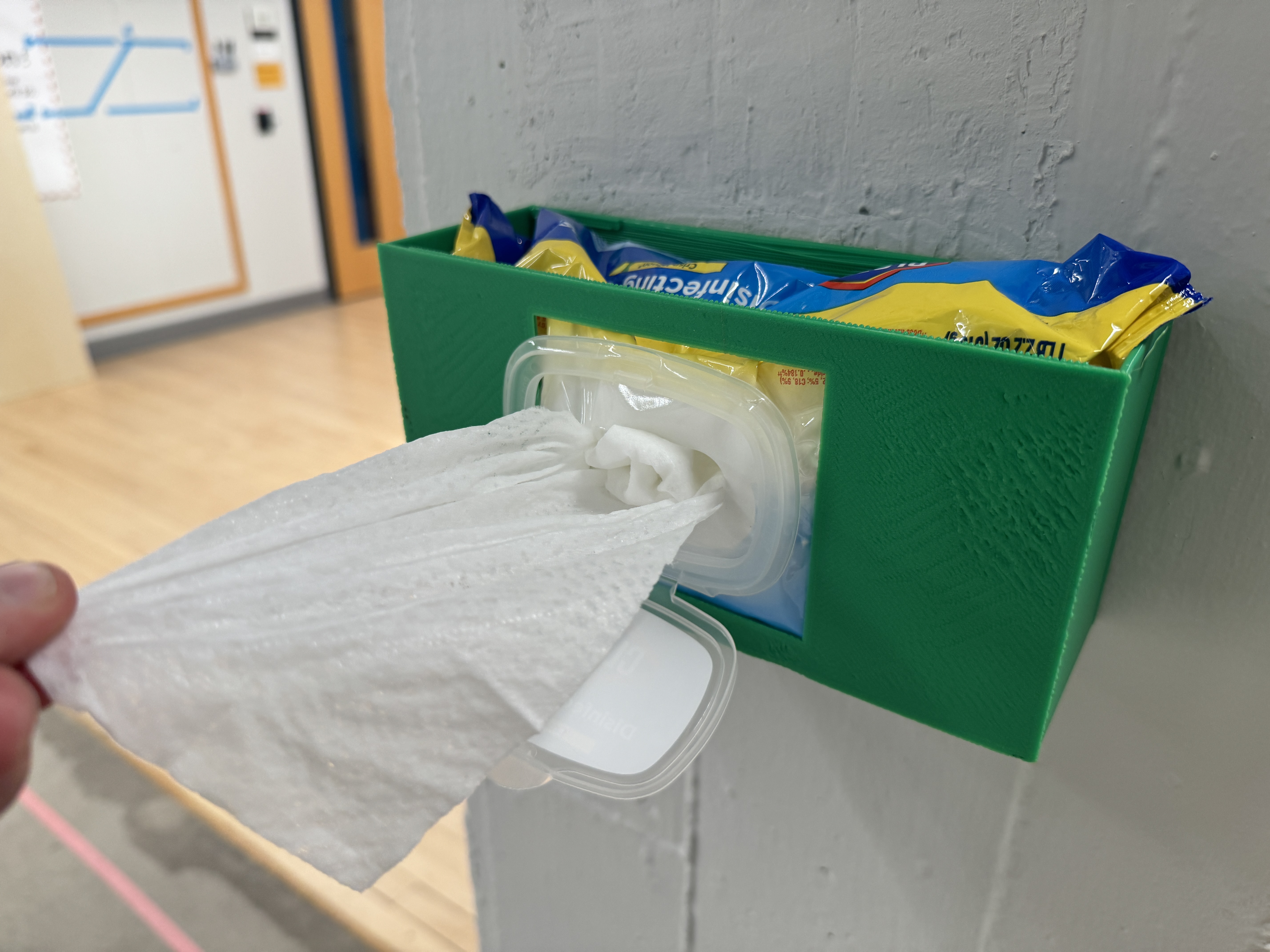
Additional ZacAttach designs were added to the space in response to observational research. One design includes a holder for sanitizing wipes, encouraging students to clean tables as needed. Another design holds whiteboard cleaner to promote cleaning of whiteboards after use.
Future iterations of the ZacAttach addressed needs within the space and responded to them.
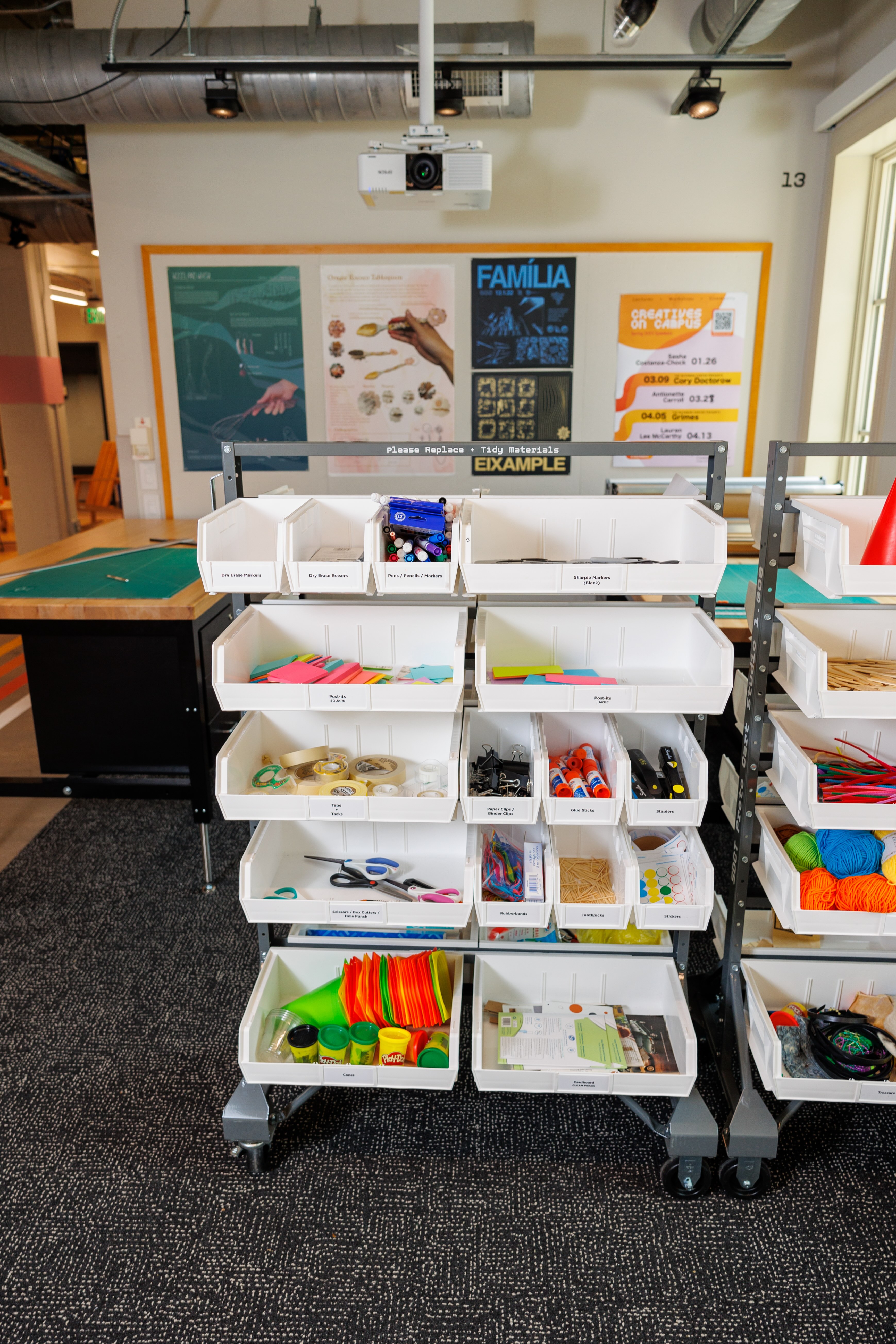
The wkrm team posed a critical question: how can students access materials when they’re usually stored in classrooms that may be occupied? This often presents a gray area, as many people are reluctant to interrupt a class to retrieve materials.
Addressing this issue, the team rolled out the existing proto-carts into the common areas, creating an all-inclusive work bay. This mobile station featured prototyping materials, paper, a paper cutter, and cutting mats, among other things. Our observations showed that this arrangement significantly increased traffic and use of the space, especially when coupled with the print station, another wkrm prototype.
This led to another question: how can we make this a more prominent and permanent feature within AHG?
As part of the Vision Plan, a second iteration of the student workspace was conceptualized and adapted. To cater to the student population’s needs, I first needed to understand the students’ activities in the department. Considering the wide variety of disciplines and mediums used in design, creating a workstation to accommodate all is improbable. Instead, I sought a middle ground for certain mediums, as indicated by the 2023 Student Climate Survey results.
These protocarts, first housed in the classrooms, were placed into the commons area, for people to use and make with.
The historic breeze block area was chosen as the workspace location. This secluded area, away from AHG’s front entry, was strategically picked to use the breeze blocks as a frame for custom drawers. These drawers would store tools and materials and keep the workbay’s busier, more chaotic vibe towards the back of the building. This setup aims to minimize noise and protect critical supplies.
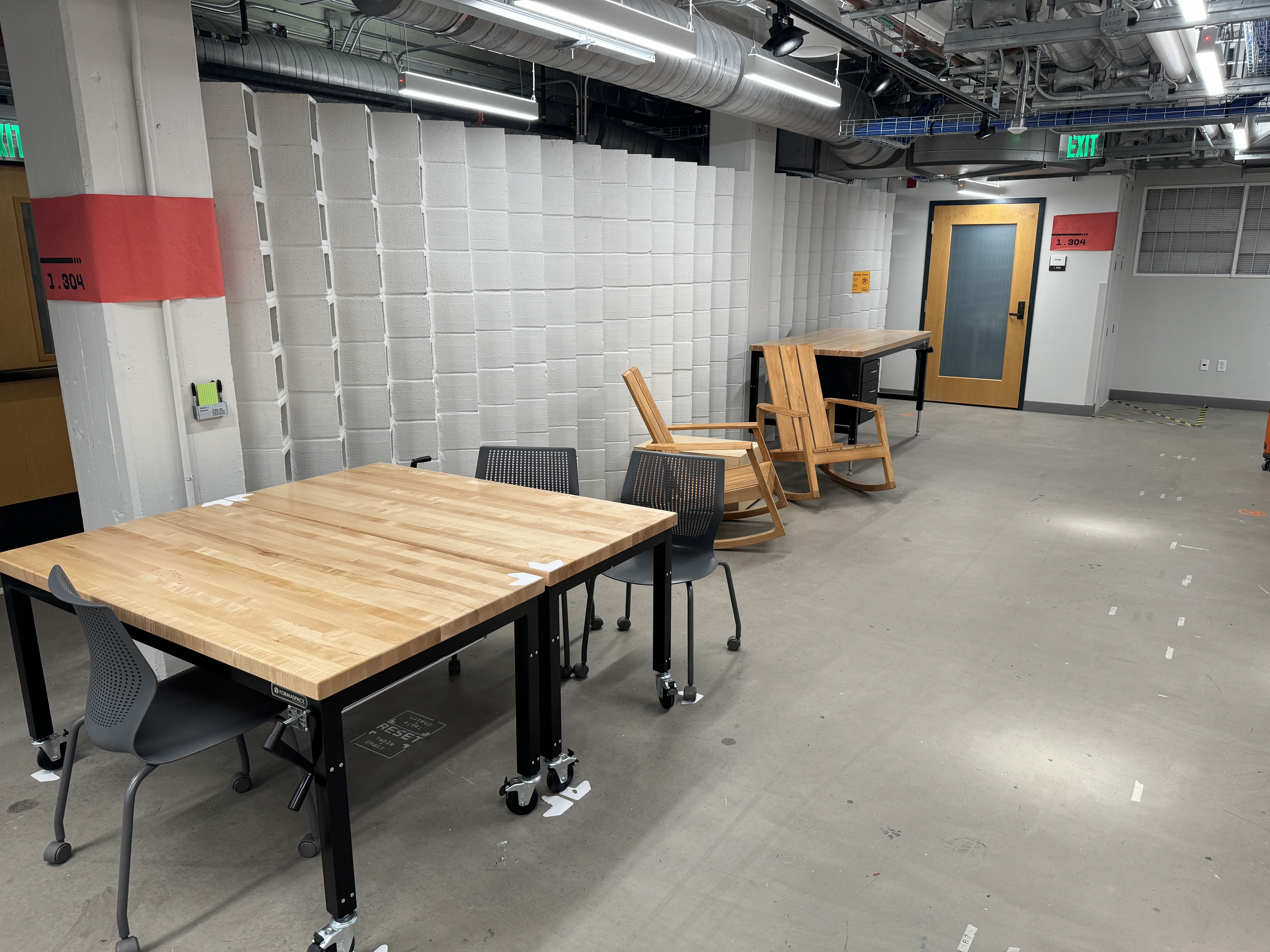
The breeze block area, located near the back of AHG, was chosen not only for it’s location near, but also for the possibilities for using the breeze blocks as a utilitarian tool.
The focus of the workstation was on active work, which meant using standing desks. Since the floor was concrete, I wanted the space to be comfortable for standing and working for long periods of time. By using some available Flor tiles, I was able to achieve a balance between the standing desks, comfort, and visual cues on where to stand in order to use the tools and other assets effectively.
The second ideation of a wayfinding sign. It focused specifically on the four classrooms in the design wing.
As part of the vision plan, an action was taken to establish a universal standard for signage within AHG. This standard aligns with the UT wayfinding standards and aims to be easily recognizable by all. Key locations within AHG have been identified to receive these signs as part of the program.
To test the effectiveness of the signs, the prototype initially focused on the first floor. Once testing and prototyping on the first floor were completed, the second floor was included in the process.
The iteration process involved researching the UT Standards and analyzing the branding and features of the signs. These findings were then used to iteratively meet the unique needs of AHG. Since most signs in the guide didn’t meet AHG’s specific needs, a custom sign that followed the standards was created.
To better understand the building’s needs, the existing wayfinding signage was analyzed. It was found to be too small, difficult to read and understand, and was paired with a nearly illegible map.
The old wayfinding system utilized an illegible map and a simple room directory with no context clues or hotspot locations, like bathrooms or elevators.
The first version of the signs used simple, yet clean language (“This Way To”) and minimized the use of color to focus specifically on the information.
These versions showed little improvement between the first and second versions. The information on the sign felt cluttered and did not adhere to the specific branding standards of the UT Wayfinding system, particularly in terms of color.
The second iteration adapted the use of color, along with elements such as floor level and building name.
During the third ideation, a site visit was conducted to refine the map and its details, aiming to make it simple and easy to navigate through the space. Welch Hall, one of the additional buildings managed by AHG’s building manager Zarko, was visited. Zarko showcased their signage systems, which served as inspiration for possible iterations in AHG within the UT approved domain.
The third ideation added a layer of color, so that specific wings could be easily located. It also included simplifying the floor plans and room numbers and labels down to the most essential and frequently accessed rooms.
The third ideation proved to be successful, testing well with visitors and students as a solid map that was easy to read and navigate. The colors provided a sense of clarity and specific “zones” of the room numbers and how to access them (i.e., the 1.100 rooms being green in color allowed people to navigate to them without scanning the directory, allowing them to move through the space quicker and more efficiently). These main signs were then installed to be a permanent installation within AHG using plexiglass and stand offs.
During critiques, Jon Freach discussed the idea of extending color into the environment, to create a cohesive system of wayfinding. Given the limited scope and parameters of the project, a few iterations were explored to include in the long-term vision of the project (see next pages for examples).
Using the third ideation as a framework, more signage was created for other spaces on the first floor, including elevator bank signage, exit signage, and stairway signage.
The Student Vision for
Anna Hiss Gym
Designed by Zac DeLane, with assistance from the Spring 2022 wkrm Team